Images are one of the three most used assets on the web alongside with JavaScript and CSS. In today's world it has become almost indispensable to use images as part of content in order to make it easier for the user to digest, images are everywhere and should not be underestimated, in this article I'll be sharing with you some of the most known practices to optimize the delivery of assets as well as the most recent and important techniques applied by great companies such as Google, Twitter, and Facebook.
Don't use gif for image animations, use videos instead.
In the last Chrome Dev Summit they have shown some really amazing things, one of the things that caught my attention was to see how things we give for granted can improve the performance of a website on a big scale.
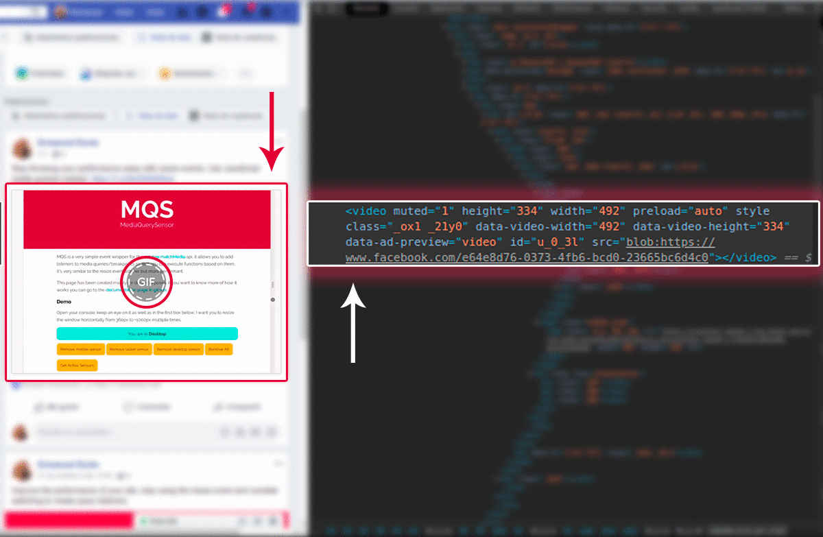
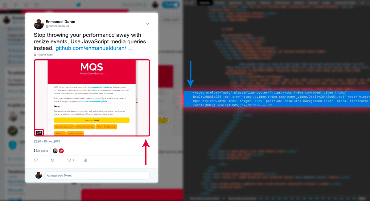
Let's take the case of Twitter and Facebook, when you upload a gif animation to these platforms, we assume that they automatically optimize the images in order to give us the best/most optimized experience (and they do) but maybe not in the way we expected... did you know that they transform the animated gif images into a video to make the site more performant?, wait, what? really? yes, they transform gif images into video format because the compression algorithm of the videos is more sophisticated and applies intraframe compression which ends up in videos with smaller sizes, check it out:
Facebook
Twitter
See how the videos even have a label saying "GIF" when they actually are videos? this of course with the end of letting users know that originally the user shared a gif. Now the fun part, let's see those numbers, I took the freedom of measuring how good is the impact on performance when having a gif image in your site vs an MP4 video and the results are great.
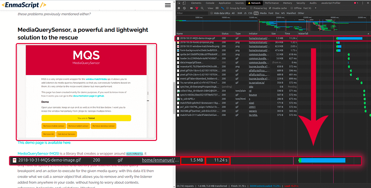
I recently posted an article using a gif to show an example and I recently changed it as well to be an MP4 video, check this:
Before being converted to MPEG-4
The gif optimized version of the image is around 1.5mb (yes, that is optimized) and it took the browser ~11 seconds to download the full image (with fast 3g).
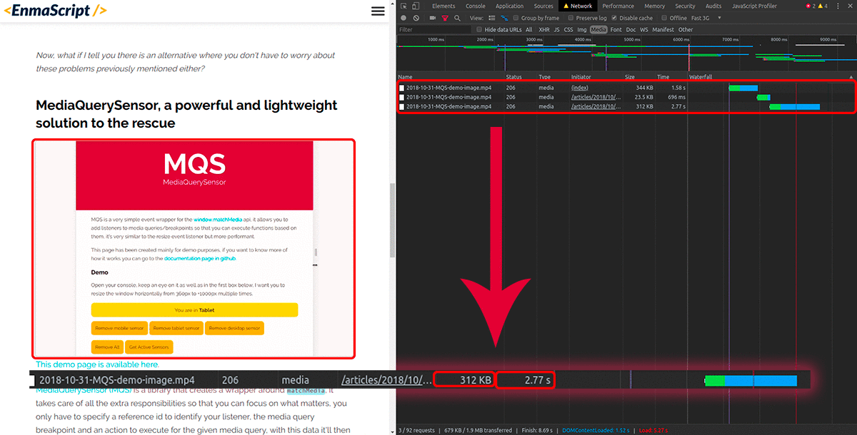
Now, let's transform our gif to MPEG-4 by using ffmpeg to do it, I will just run the command ffmpeg -i image.gif image.mp4 and it'll automatically convert my gif to a mp4 video, then to make the video look like a gif I'll use the <video> tag with the next attributes:
<videoautoplayloopmutedplaysinline></video>
Check out the results:
After being converted to MPEG-4
BOOM! just like that the video weights ~350kb, that's around 23.3% of the original gif size, 76.7% less than the original gif and it took the browser around 2.8 seconds to download it, no more words needed, if you use animated gifs in your site, you have a mission. Also as a plus, if you think this is great now, imagine in the near future when all browsers start to support AV1 compressed video format, it's around 30% better than WebM, and about 50% better than MPEG-4, you can learn more about it here.
Serve the correct size of images for the correct size of screen
The web is no longer a computer's thing as you may have noticed in the last few years, this means that we don't longer have to serve big images or resources if the people seeing it will be on a mobile phone or a tablet where the screen will not allow the image to be seen at its full size, it's a good idea to have multiple image resolutions for such cases, there is a well-known module to achieve this in javascript, it's called Jimp, depending on your stack you could do it with a different tool/module.
After generating your images dynamically you can then decide when to show them by leveraging the srcset attribute from HTML5:
<imgsrcset="img.jpg 480w, img-medium.jpg 768w, img-large.jpg 1080w"size="50vw"src="img-large.jpg"alt="A great image"/>
In this way, we're letting the browser know which images to use and when. To learn more about how to use this technique check MDN Responsive Images.
Use WebP Images with the picture tag to use better-compressed images and get compatibility between browsers
WebP format has been around for a while now, it's not fully supported by old browsers but it already has some decent support and if we use the <picture> tag with it we can extend the browser support even further.
Why should we even bother to use WebP Images at all? the answer to this question is very simple, WebP Images are 25-35% lighter than PNG and JPEG images, and sometimes transforming a PNG image to WebP could reduce its size close to 45%, if you want to know more check this study made by Google. Ok, now let's analyze the following implementation:
The <picture> tag kind of works like the <video> tag but for images, inside of it you specify the images that you wish to load by using source tags and you add a srcset attribute. Now, why is it good to use this tag alongside with WebP? good question, when the browser reads the sources inside the pictue tag, it will only fetch the first supported image format found which means that if WebP is used in the first <source> tag and it's not supported you can just specify a PNG or JPEG fallback and it'll work just fine, also as an extra security step you can specify an image using the <img> tag for old browsers that don't support the <picture> tag.
Lazy load images that are not in your critical path
You probably know about this technique already but lazy loading images is probably one of the most important steps (if not the most important) when serving images in your site, great sites only load images for users when required and not before that, it saves a lot of time and effort from the initial page load which results in your site ranking better and your users being more happy. A well-known package to handle lazy loading in javascript is lazysizes. The idea is to load image progressively as the user interacts with your page, this avoids stress in the network due to fetching of resources that might not even be needed. A code example of how to implement it is:
You just have to add the data- prefixed attributes as well as the lazyload class and that's it, also this technique is applicable not only for images but for iframes, videos...
Advice: If you're going to use a different module or you're thinking about building your own lazy loading script, make sure that the script uses Intersection Observer API for this instead of scroll events, this will avoid performance issues and will provide a smoother experience.
Extra recommendations:
Compress your images with Lossy Compression, an ideal starting point is between 80-85% of the original image quality, this keeps most of the details and drops the file size between 30% and 40%, but this is not something that will work for all cases, many times you can compress images even further depending on the type and priority of the given image in your site. A module to help you with this task is imagemin, it has plugins for lossy and lossless compression, it's always recommended to use lossy compression but depending on your case you might find lossless compression more adequate.
Ok guys I think that's it for this article, if you enjoyed it be sure to leave a comment and share it with your friends, remember that you can find me on twitter @duranenmanuel or just write me an email at duranenmanuel@gmail.com.
Big O notation allows us to evaluate the performance of algorithms so that we can determine their efficiency and make decisions based on this determinations, let's try to understand how this notation works and how we can apply it in our lives as software developers.Read more
Linked Lists are a fundamental data structure in the world of software development, in this article we will explore its implementation and its applications in today's worldRead more